Redesigned Bereke Bank's SME mobile app, taking it from fragmented outdated flows to a product that lifted conversion 24% and pushed SUS from 52 to 78 — the highest score in the Kazakh SME banking segment at launch.
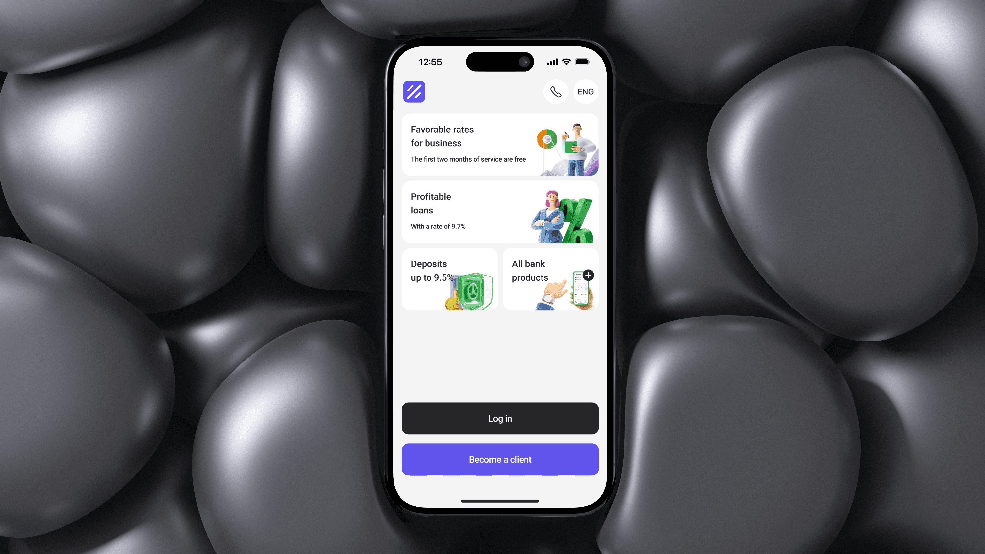
Bereke Bank's B-Business app was the SME-facing product of one of Kazakhstan's largest banks, and the usability data showed it: SUS score of 52, well below the 68 industry baseline. Conversion on key flows was below internal targets. Users described the app as "feels like five apps stitched together."
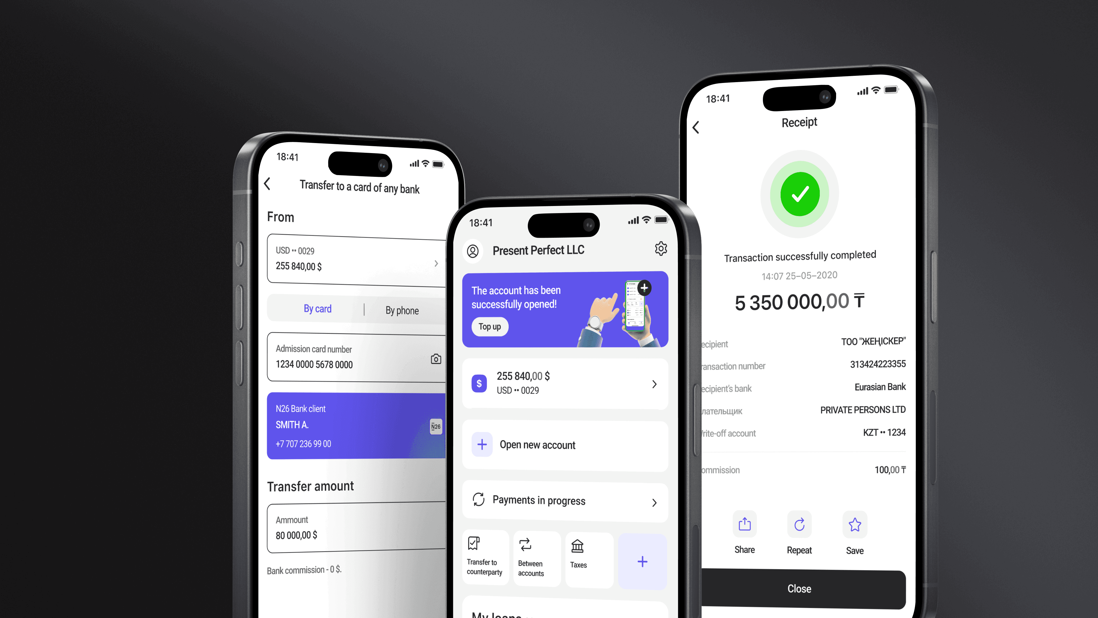
Diagnostic work revealed the cause: the app had grown by feature accretion. Each new product line had been added as a separate flow, with its own pattern, language, and visual treatment. There was no shared spine.
Brief: rebuild the experience around a coherent system, lift conversion, and push SUS into industry-leading territory.
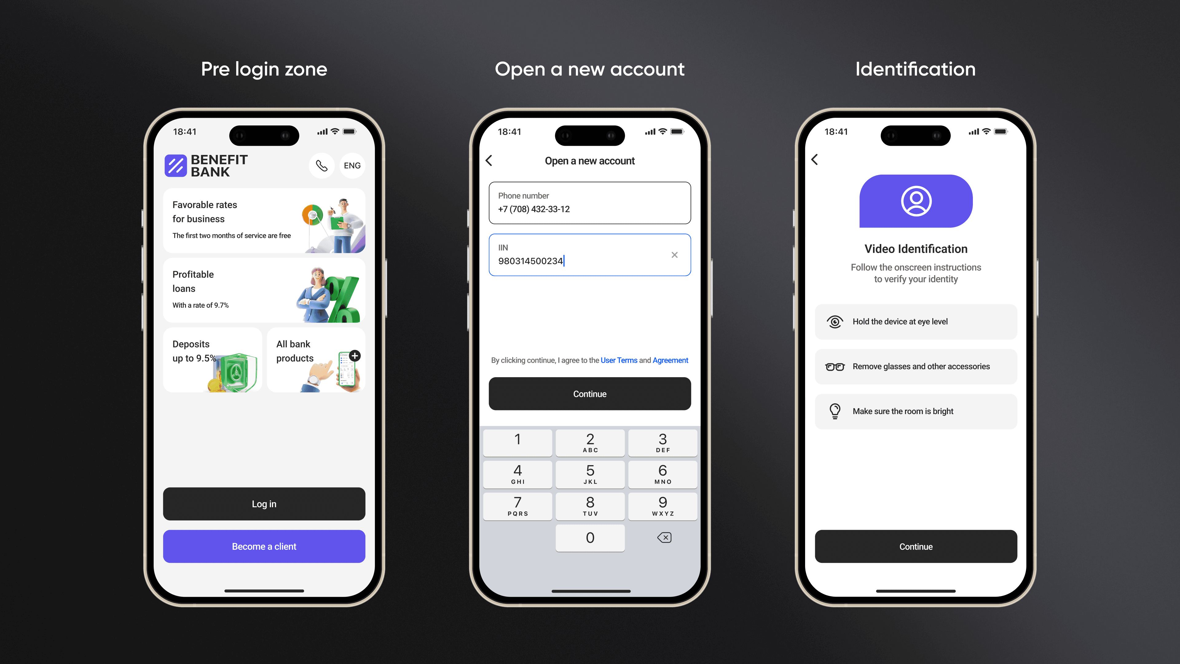
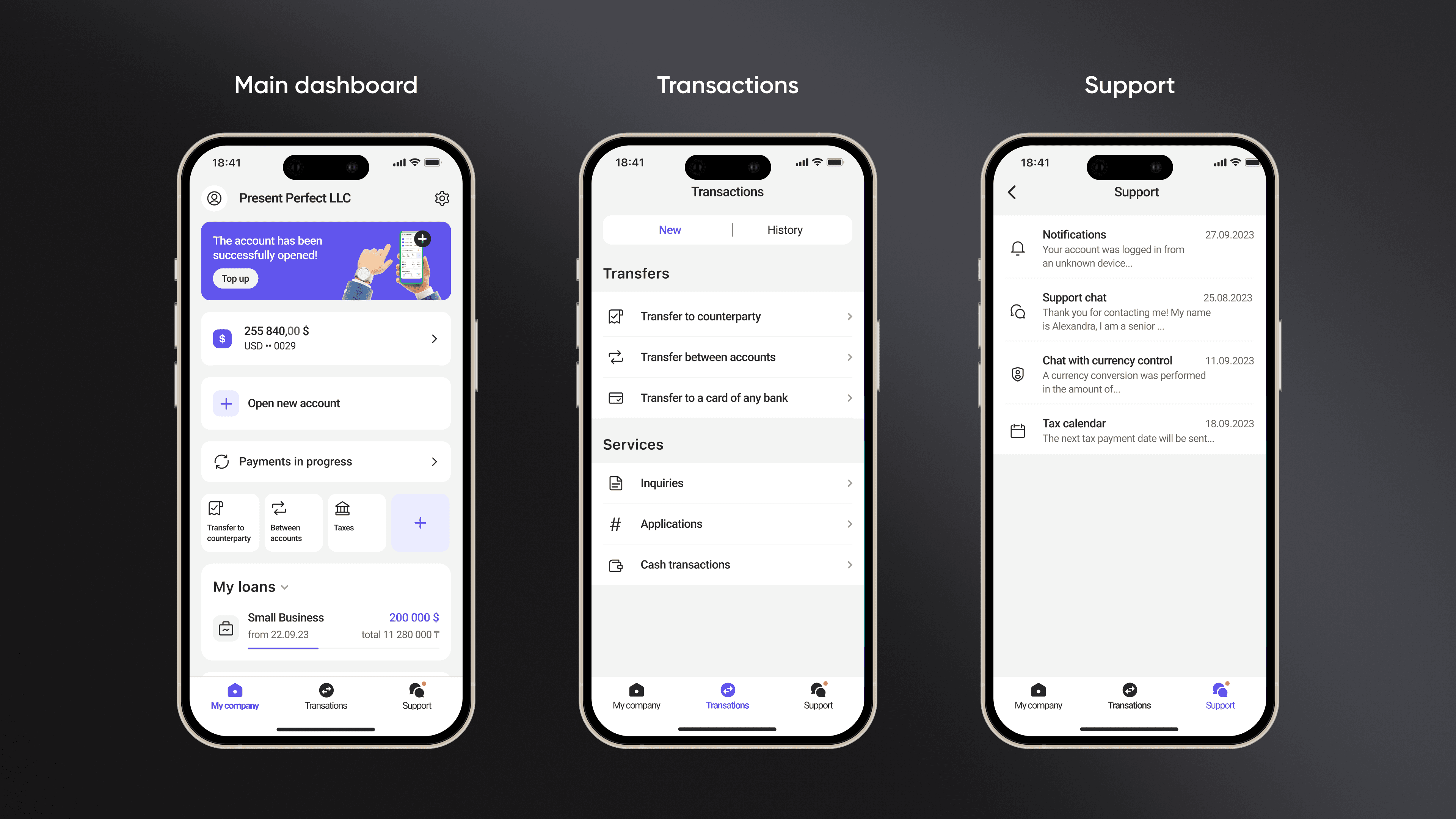
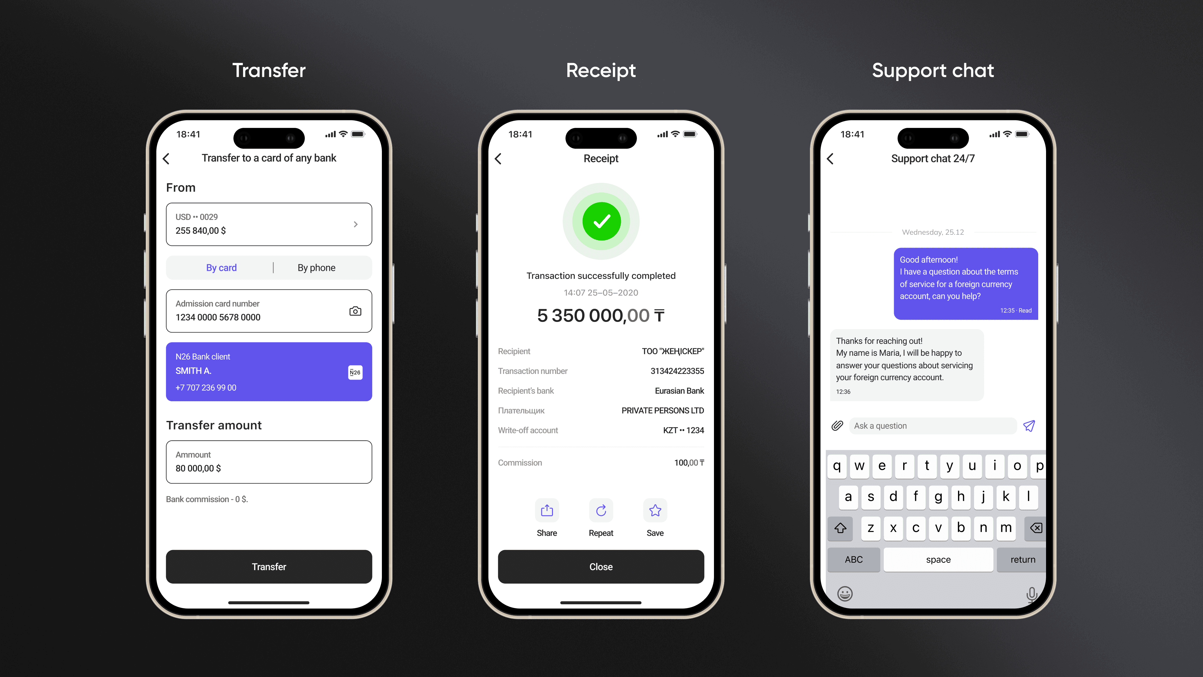
A 26-point SUS lift doesn't happen by polishing screens. It happens by giving the app a shared spine — consistent components, language, and patterns — so users learn the system once instead of relearning it on every flow.
This case is the proof point that SME banking UX is mostly a systems problem disguised as a screens problem. The visual redesign got credit at launch. The system underneath did the actual work.
Want to discuss this project?