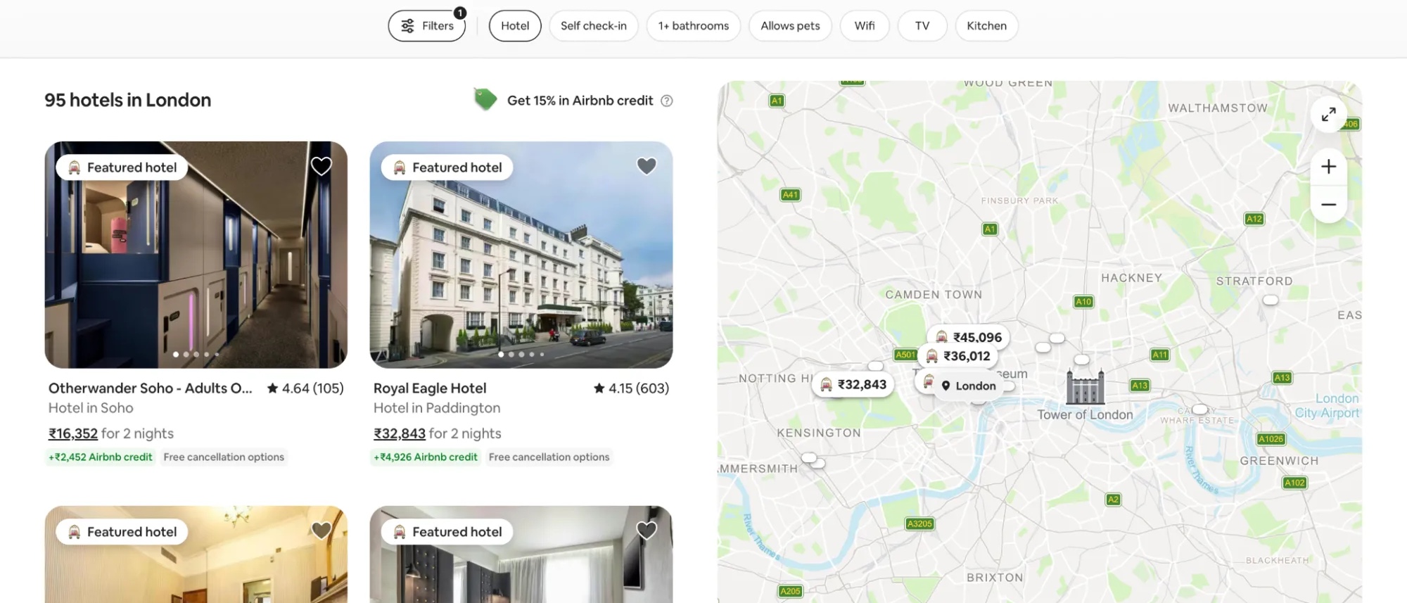
Five category levels to reach a pack of garden tool batteries. Airbnb gets me to an apartment in London with zero.
Last week I walked seven German shopping sites and screenshotted every step: idealo, CHECK24, IKEA, OTTO, Westwing, XXXLutz, Zalando. Homepage, category, listing, product page. No account, no tricks.
I wasn't comparing products, so I took whatever category each site is built around, from bathroom units to garden chairs to hoodies. What I counted was structure. Clicks to a product. Filters on screen. What a page shows you before it shows a price.
Nobody in the category was worth copying.
The counts
Depth to one product page: five levels of breadcrumbs on idealo, four on IKEA, three on everyone else, and on XXXLutz a full landing page before those three start.
Filters, once I finally reached a listing: fourteen groups on IKEA, every one collapsed until you click it, thirteen on OTTO, ten on Zalando. Three of the seven keep the panel shut, so I never saw the fields until I went looking.
Product pages run long. Ten content blocks on IKEA, around seven on most of the rest, and on Westwing and Zalando the dimensions and materials sit closed inside an accordion.
Airbnb throws the tree out and asks three questions instead. Where, when, who. Seven chips above the results, everything else behind one panel.
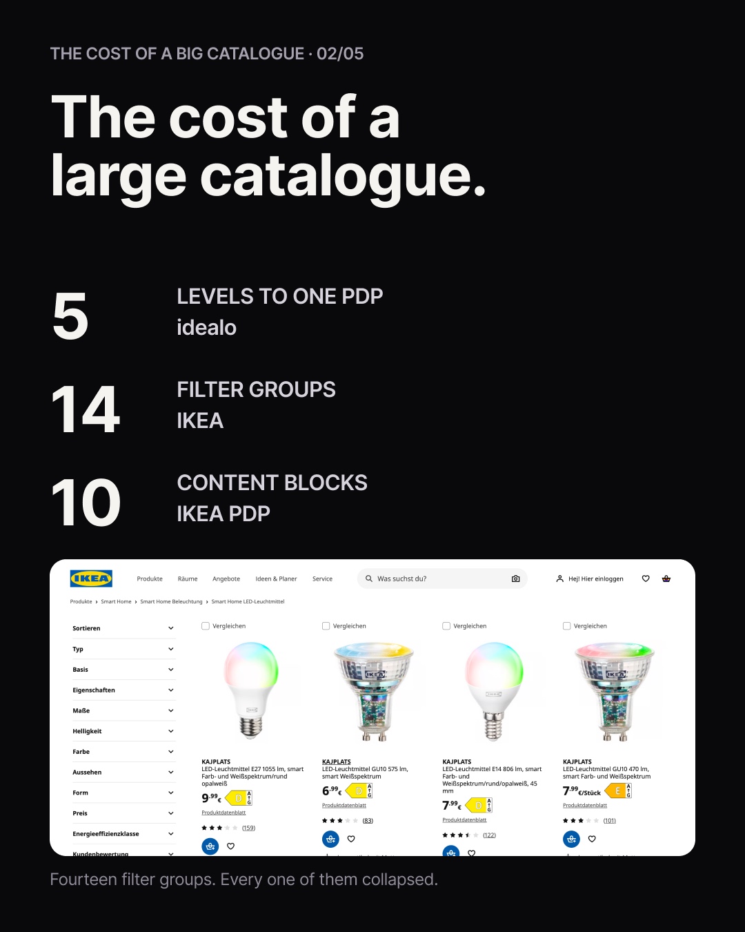 The catalogue charges you for entry — in clicks, before you see a price.
In their defence
Carry that many items and attribute coverage goes uneven. Some products have dimensions, materials and delivery windows filled in properly. Many don't, and patchy data shown openly makes the gaps obvious on every second product. So it gets hidden behind accordions and "more details".
The rest follows. Deep trees exist because SEO wants them. Promo blocks interrupt the listing because merchandising has quarterly targets. The mega menu repeats the category page because two teams own them separately.
Every one of those is defensible alone. Together they build a page where the structure of the shop competes with the thing I came to look at.
So I cheated
I took Airbnb instead, and the reason is structural. It doesn't build the apartments or own them, and everything it's worth comes from how it presents somebody else's inventory. That's my shape too: at InteriorTrends I don't manufacture furniture and I'm not really running a shop, I'm closer to a pocket interior designer that happens to know the catalogue.
What Airbnb does instead
It starts from my task, not from its catalogue. Where, when, who. Three decisions I can make before knowing anything about what's available. Then a homepage where every row is named: popular homes, your next trip, available next month. I can disagree with a row, but I always know what it's claiming.
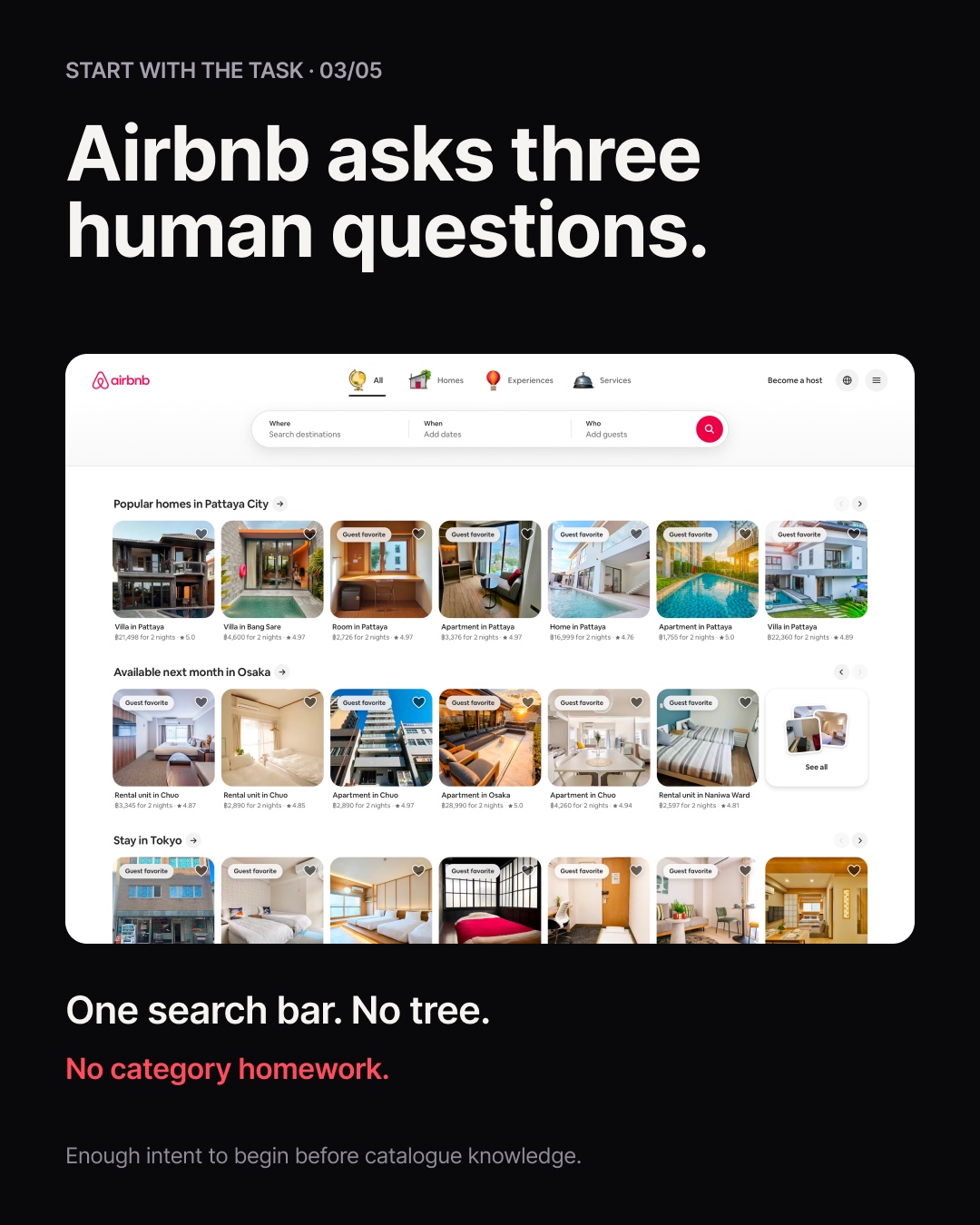 Three decisions I can make before knowing what's available.
In the results, roughly half the screen goes to the map. Half. In my category that space would be a filter sidebar and a spec table. Airbnb spends it on context, because where a place sits relative to everything else is part of the product.
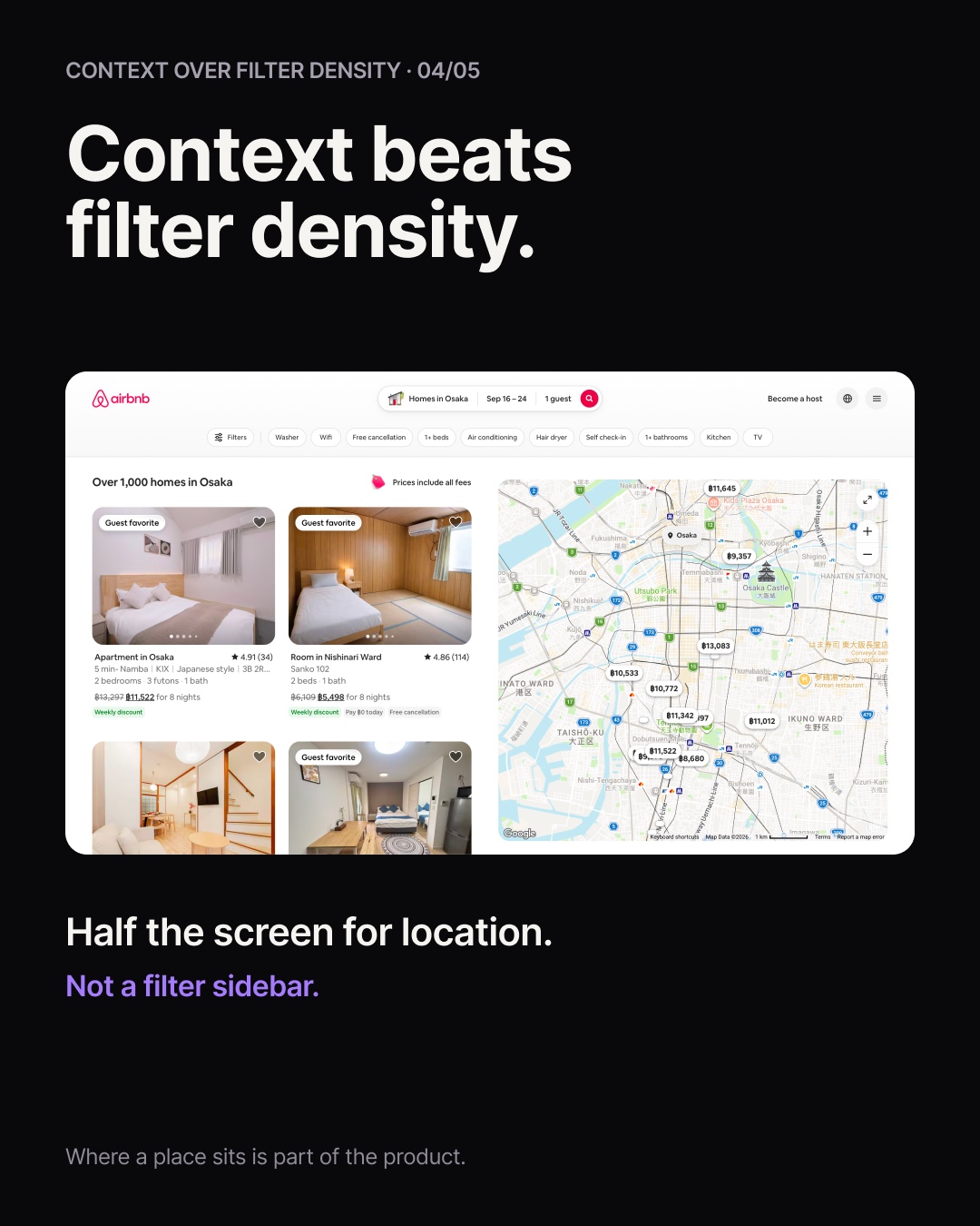 Half the screen on context, not on a filter sidebar.
The listing page order is what I keep thinking about. Large gallery. Then a short description of what the place is like. Then three named reasons to care. Amenities, rules and full detail only after that.
Where Airbnb loses
Two things the German sites do better, before this turns into an advert.
Zalando is why I kept a fashion site in a furniture study. Clothing to Men's Clothing to Hoodies: the grid, the breadcrumbs and the chips stay exactly where they were. You never relearn the screen. Sounds boring until you watch someone move through four levels of a site that reshuffles itself each time.
idealo is the strongest of the seven at supporting a real decision: price history, normalised attributes across sellers, an editorial verdict, pros and cons. Working out whether a thing is worth the money, it gives me more to think with than Airbnb does.
So the German market isn't weak everywhere. It's strong on comparison and weak on desire. Airbnb is the reverse.
Then I looked closer
I went looking for how Airbnb explains a recommendation. It doesn't.
"Featured hotel" carries no disclosed criteria. "Recommended for you" sits at the top of the filter panel without saying what it's recommending from. The bottom of a listing page offers other options around Greater London, widening the search geographically without ever saying what those alternatives share with the place I just spent four minutes on.
Back through the seven German sets, same thing. They label the type of connection honestly enough: similar items, accessories, same brand, other visitors also viewed. None of them says why this item is in front of this person.
Not one of the eight. Including the benchmark I picked precisely because it beats the rest.
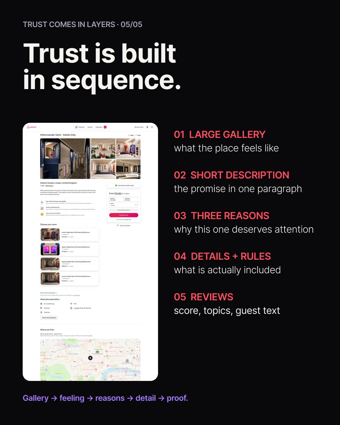 Gallery, three named reasons, then the detail — and still no stated why.
The other side of it
I'm not speculating. I've spent a good part of this year inside this exact problem, and the design half is not where the difficulty lives.
How to phrase a reason, what to compare against, how much to show at once: all solvable, and quicker than you'd expect. What decides whether any of it can exist is whether both items carry the same attributes as structured data. To say two things match on oak and 140 centimetres, both have to know they are oak and 140 centimetres.
That part is slow, unglamorous, and nobody puts it in a portfolio. It is also the whole gate.
Which reframes the seven. At their scale the gaps are never fillable, so "others also viewed" isn't a lazy choice, it's the only sentence they can say truthfully. And Airbnb never had to solve it, because where, when and who narrow the world down enough that the recommendation barely has to work.
If you work on anything that recommends, that's where I'd start. Not how to phrase it. Whether you'd have anything to put in it.
Fine print
I'm not calling IKEA and OTTO bad at their jobs. At their catalogue size I'd hide my data too.
And I haven't closed this one either. So take it as a note from inside the problem rather than a verdict on it. Ask me in six months.