Restructured the mobile banking experience for one of Uzbekistan's largest private banks — onboarding, transfers, and navigation rebuilt from user mental models, not legacy IA. App Store rating moved to 4.5; flow completion lifted 31%, daily active users 24%.
Davr Bank had one of the largest mobile banking user bases in Uzbekistan and one of the lowest App Store ratings in the segment. The app worked, technically. Users could transfer money, pay bills, manage cards. They just frequently couldn't figure out how.
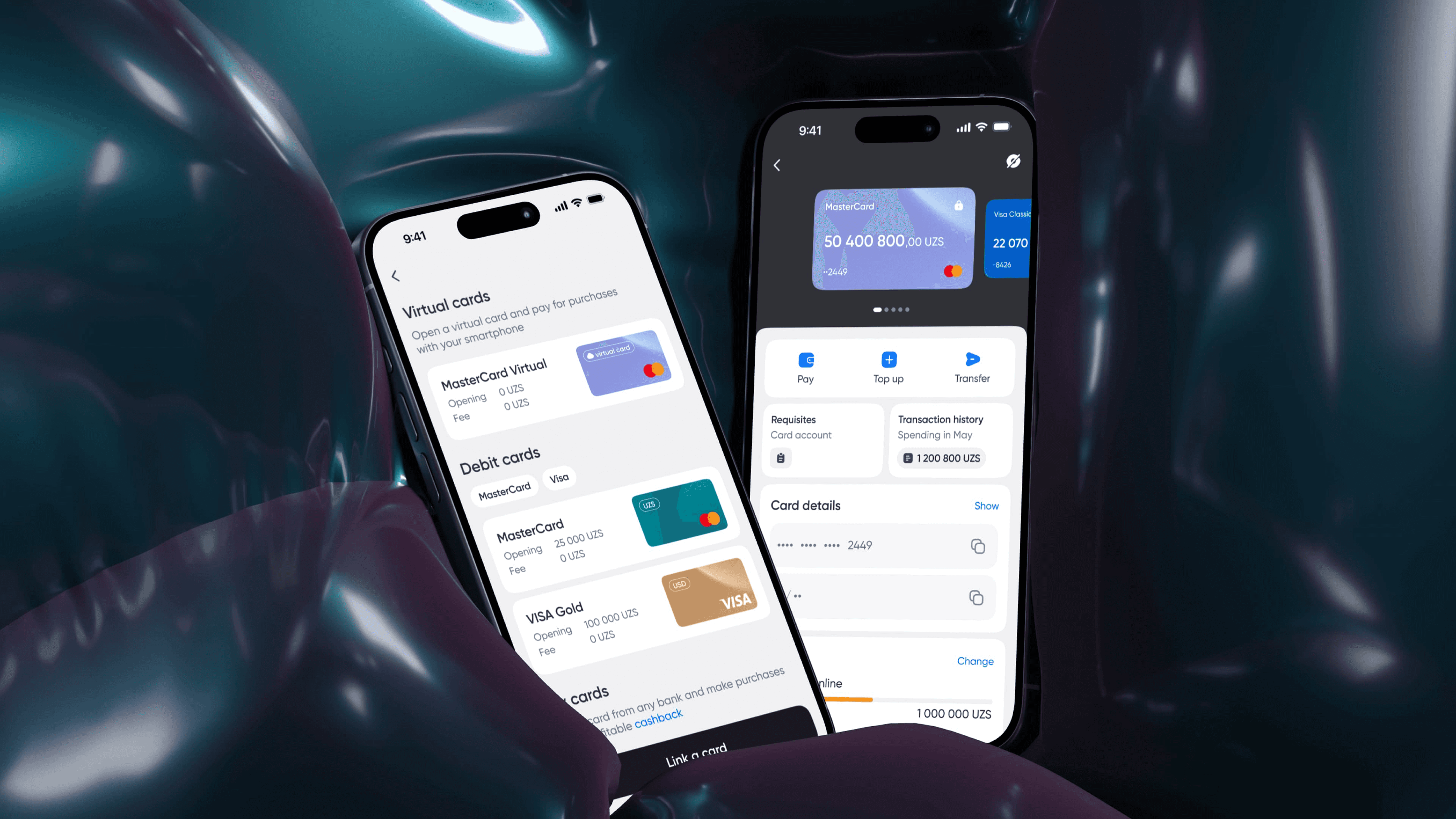
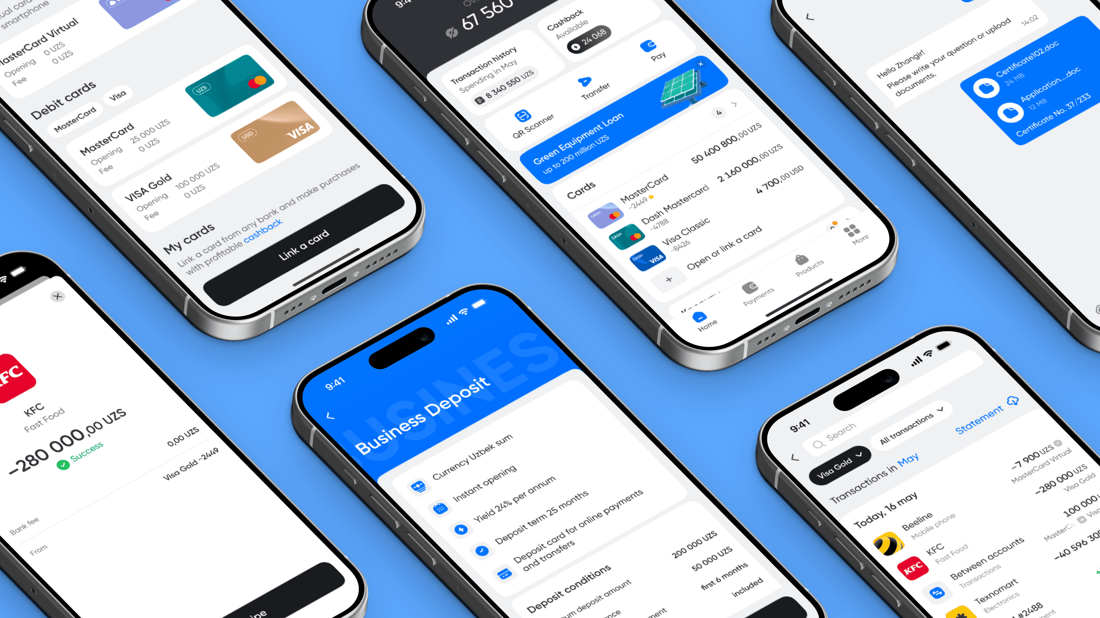
The legacy navigation followed an org-chart logic: features grouped by the internal department that owned them, not by user intent. A user trying to send money to another person had to choose between five entry points across three tabs.
Brief: lift completion rates and daily active users without rebuilding the backend. Constraints: feature parity with the existing app, no new APIs, ship in one quarter.
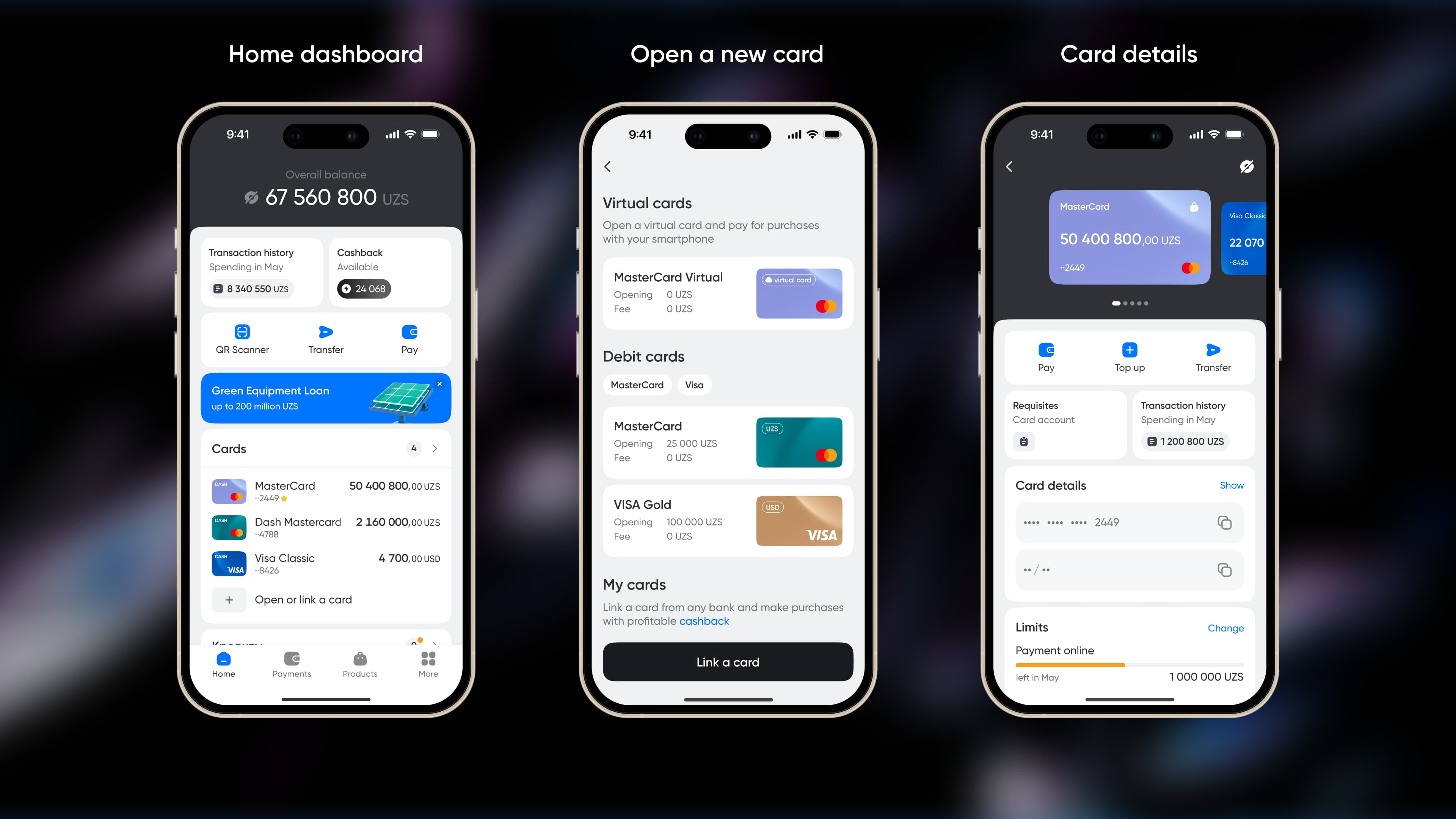
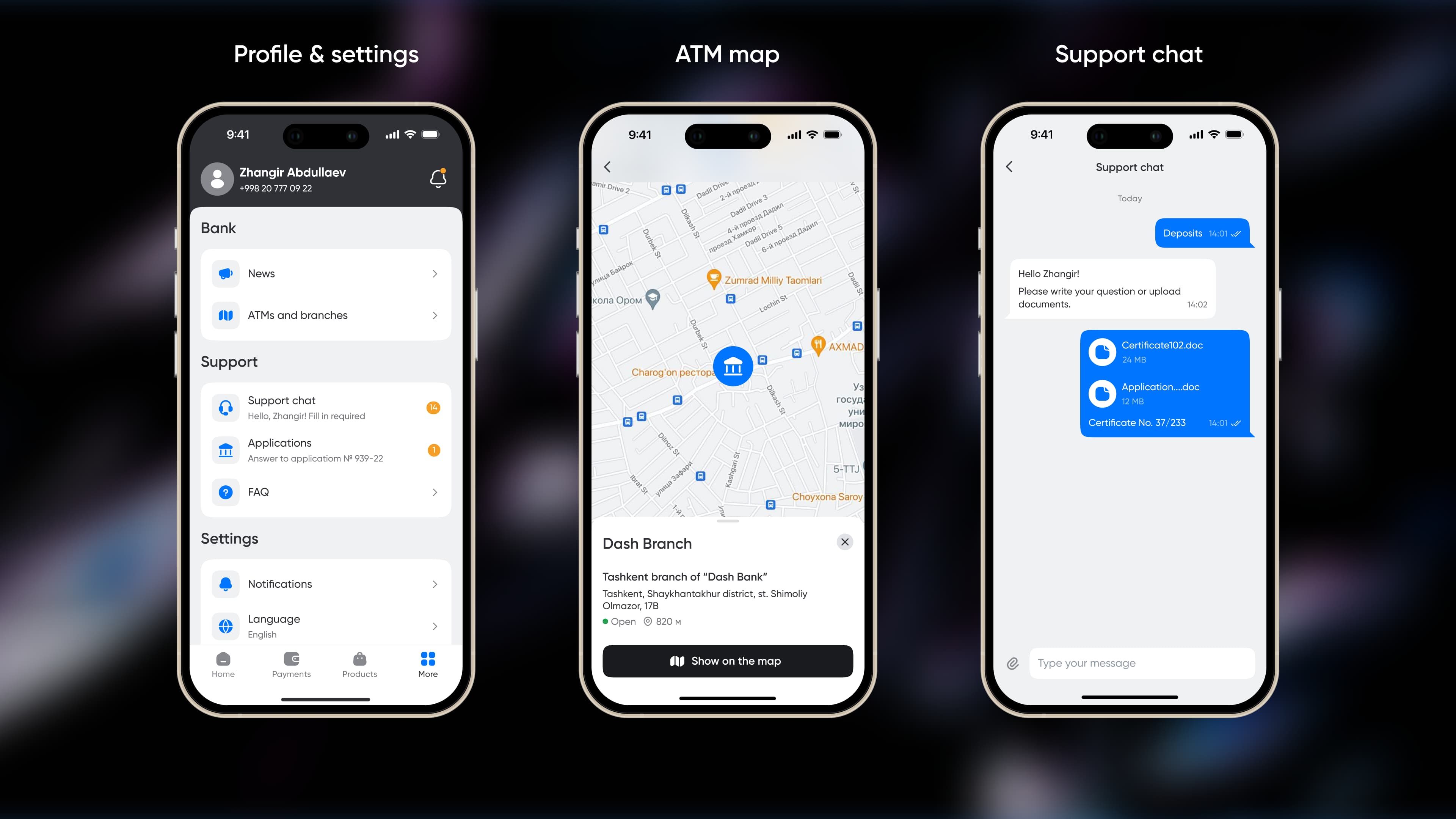
The redesign started with user research, not Figma. Interviews and observed sessions revealed a clear pattern: users think in tasks ("send money to mom," "pay rent," "see how much I spent this month"), not in product categories ("transfers," "payments," "analytics").
Most bank app redesigns get sold as visual refreshes. They look better and behave the same — and the metrics don't move. The Davr work is the opposite case: the visual layer changed, but the actual lift came from rebuilding the information architecture around user intent.
The +31% flow completion is what happens when navigation matches the way users actually think about their money. Visual polish without IA work is a paint job on a broken floor plan.
Want to discuss this project?