Interior Trends:
seven shops and Airbnb,
not one says why
Founding product designer and equity partner on an AI-first discovery platform, live in Germany. Named routes into the catalogue instead of a category tree, and a product page that says why a thing fits.
Everyone sells the catalogue. Nobody explains it.
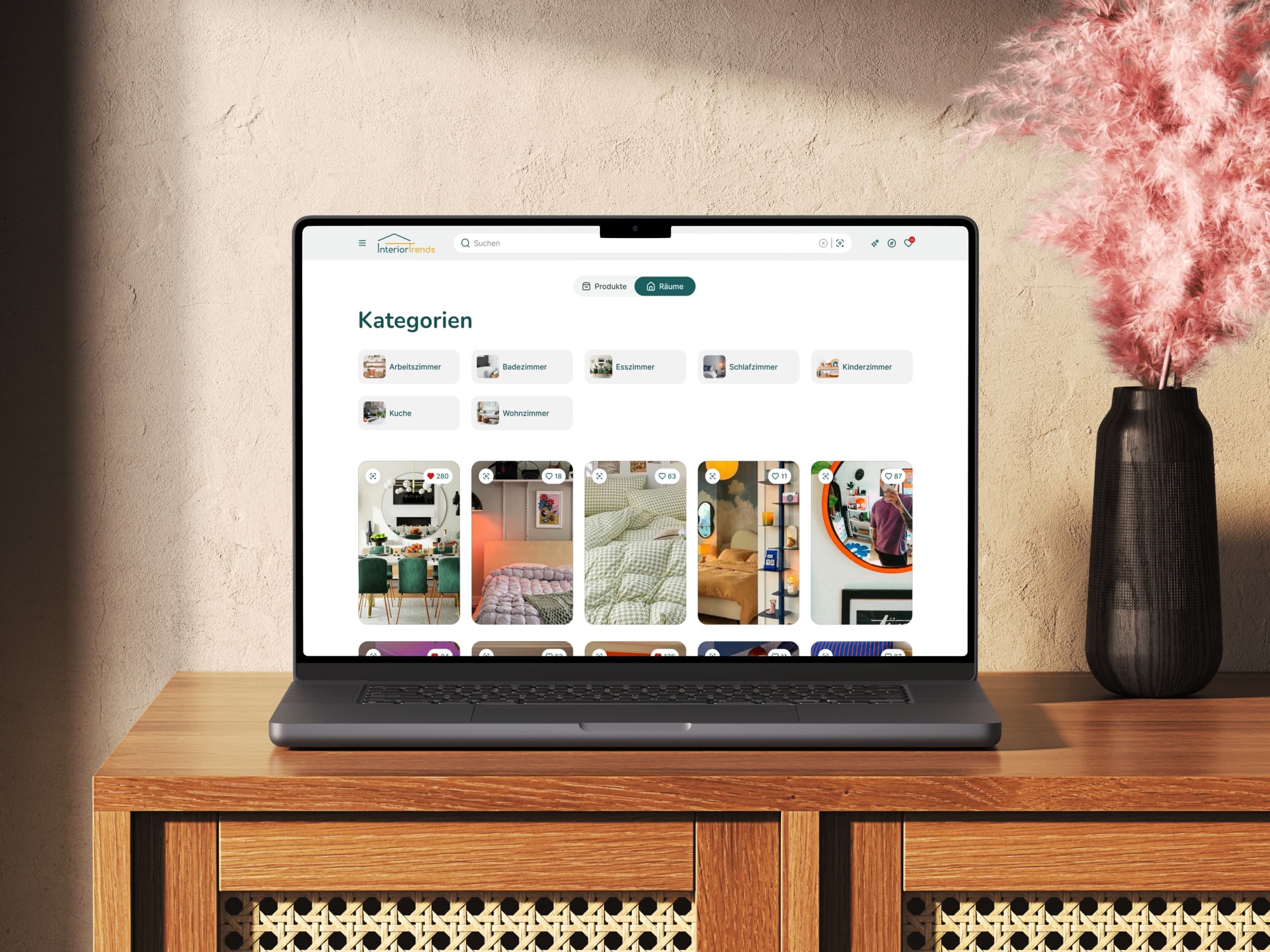
Every shop in the category opens on a tree and asks you to walk down it. We open on named routes instead — products, inspiration, or everything at once — each a way into the same product page. That page is the actual product: not a spec table, but an answer to why this thing suits you. We don't make the furniture; presenting it better than the people who do is the whole business.
Ran a diary study before designing anything
Eight German homeowners, two weeks. Interior discovery turned out to be visual and mood-driven — people think in rooms and feelings, not in "mid-century walnut, 120cm".
The two weeks that set the interaction modelKilled a search box that already worked
The first prototype opened on a text field and returned results. People arrive holding an image or a room, not a phrase, so a text field could not stay the starting point.
The entry stopped being something you type intoNamed routes, not a category tree
All seven German shops start with a tree — up to five levels before a product. Products, inspiration and a combined view sit as peers instead, each leading to the same page.
Closest thing in the sample to Airbnb's modelSay why, not just what
I walked seven German shops and Airbnb, screenshotting every step. All eight label the connection. None states the matched features, so that is what our product page does.
The one thing the category doesn't doFound the gate, and it isn't design
Explaining a match is a wording problem only after both items carry the same attributes as structured data. To say two things are oak and 140cm, both have to know they are.
Attribute work reprioritised as product, not catalogue hygieneDesigned to one engineer's capacity
With a single engineer, every decision had to be cheap to build or clearly worth its cost. The token system went into code in month one, not after launch.
Six-week MVP · 80%+ of surfaces on components by month twoThe long version — the market, the study, the rebuild
The German furniture and home goods market is one of the largest in Europe and one of the most fragmented: 200+ active retailers, no unified product taxonomy. The buyer journey looks like this — see a sofa on Instagram, save the screenshot, spend twenty minutes searching for "grey velvet sofa" across Westwing, Made.de, Otto Home and a dozen others, give up. Existing search tooling is text-based and category-bound: you can filter by brand, price and size, but not by what something looks like, what fits the room you already have, or what is available across retailers.
I started with an eight-person diary study with German homeowners over two weeks. The finding reframed everything: interior discovery is visual and mood-driven, not keyword-driven. People react to a room rather than a spec sheet. Nobody types "mid-century walnut sideboard, 120cm" — they think in moods and spaces: "something that feels like a Scandinavian cabin but fits a 12m² room." That one insight defined the AI interaction model: similarity and room context over text search.
From there the path was deliberately short — interaction model → Figma → a clickable Framer prototype → usability sessions (15+ to date) → a six-week MVP build with one engineer. The interaction model was validated with real users before hand-off, so the engineering build went into something already tested.
What that reframe became, two years on, is a set of named routes rather than a single clever search. Products, inspiration and a combined view sit as peer entries; the tree is kept for people who want it but no longer owns the front door. Search is still there and takes an attached image as readily as a phrase. All of it converges on one product page, where the work is no longer finding the item but arguing for it: the matched features stated in words, sub-scores, pros and cons, and the same product priced across shops.
In August 2026 I benchmarked the result against seven German shops and Airbnb, screenshotting every step from homepage to product page. The finding that mattered was not about layout. All eight name the type of link between two products — similar items, same brand, others also viewed — and not one of them says why a particular item is in front of a particular person. Including the benchmark I had picked precisely because it beats the rest.
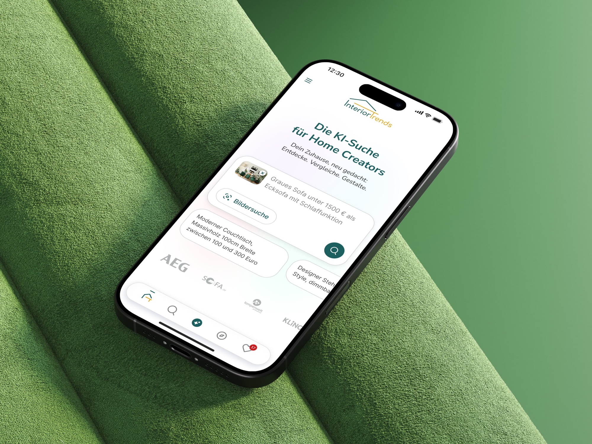
0→1 with no map
- No reference pattern — no established image-first furniture discovery product to learn from, anywhere.
- No existing research — zero prior user data; every assumption had to be built and tested from scratch.
- One engineer — every design decision had to be cheap to build or clearly worth its cost.
- A fragmented market — 200+ retailers with no shared taxonomy to search across.
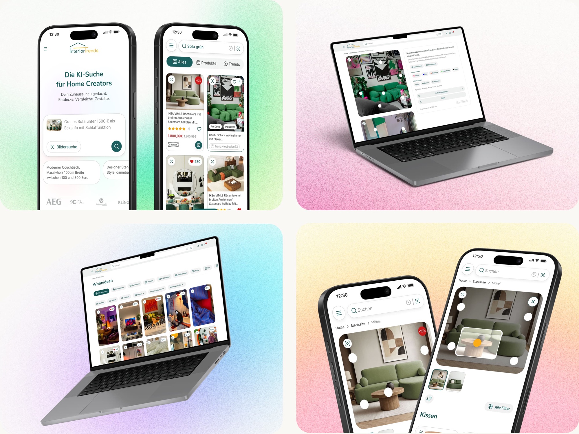
What the model produced
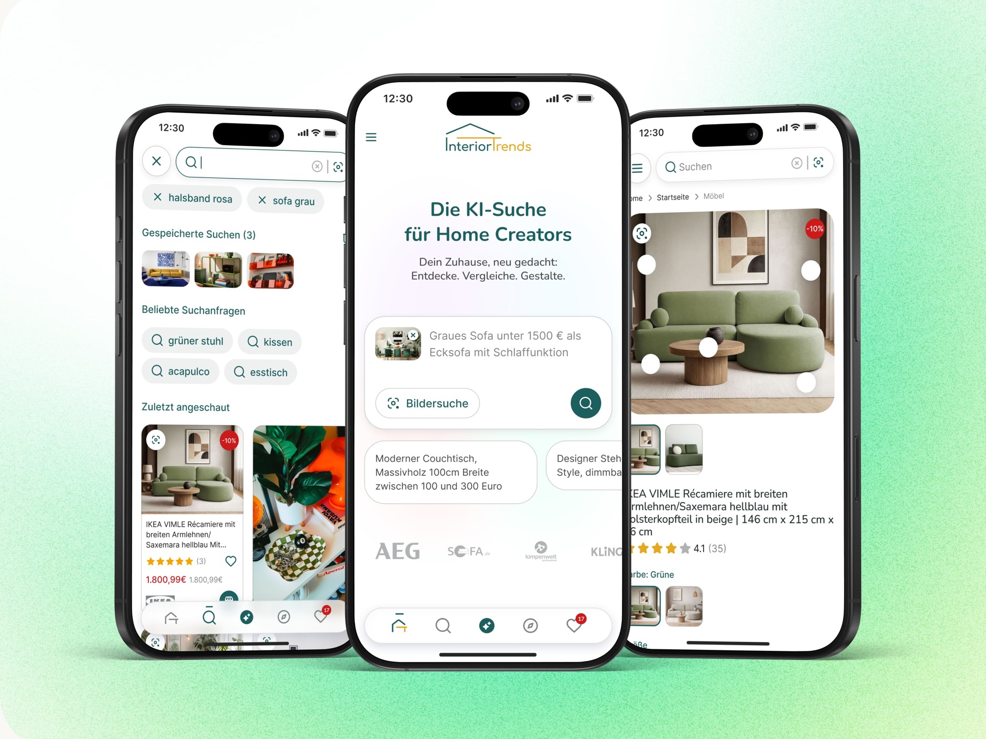
A system doing the work of three designers
Atomic tokens for colour, type, spacing and elevation; a component library covering 80%+ of UI surfaces by month two; light and dark from day one. The system lives in code — tokens plus a Storybook-documented library — which is why one product designer, co-managing the team with the CEO, can ship a complete AI e-commerce platform without slowing a single engineer down.
 Tokens and a Storybook-documented library — the reason one designer keeps pace with the build
Shipped, live, instrumented
Live in Germany and iterating with its first users. 0→1 end to end — research, interaction model, design system in code, launch — with 15+ usability sessions behind it and PostHog tracking every key interaction since day one.
In August 2026 I benchmarked the live product against seven German shops and Airbnb. It confirmed the differentiator and, more usefully, named its dependency: the explanation only reaches as far as the structured attributes underneath it.
“During our collaboration on the HomeTrends Project, I had the opportunity to witness his creativity, analytical thinking, and ability to quickly grasp new concepts. Nikita's designs are not only visually stunning, but also thoughtfully crafted [...]”
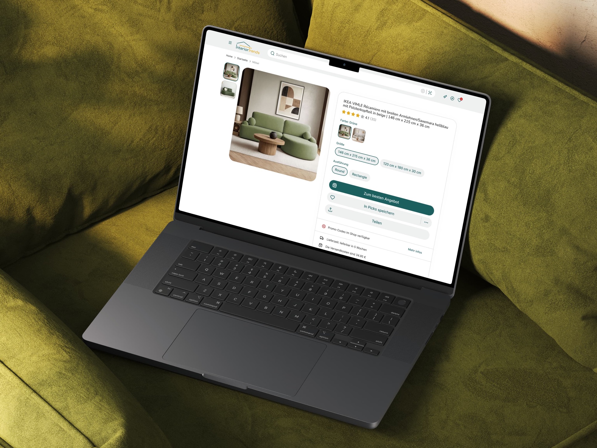
AI as product spine, not feature sticker
Most "AI-powered" e-commerce features are bolted on — a chatbot in the corner, a row tagged "AI Picks". They sit beside the flow without changing it. Which is why the benchmark found eight products that can tell you two items are related, and none that can say why.
Interior Trends starts from the opposite assumption: AI is the discovery surface — the routes in and the argument on the product page are both it. There is no onboarding nudge, because there is no feature to push people into. AI in product is a positioning question before it is an integration question.
Which only held because of the study. The search box felt obviously right; the users proved it obviously wrong. The benchmark two years later was the same move, run on a product that had already shipped.
Want to discuss this project?