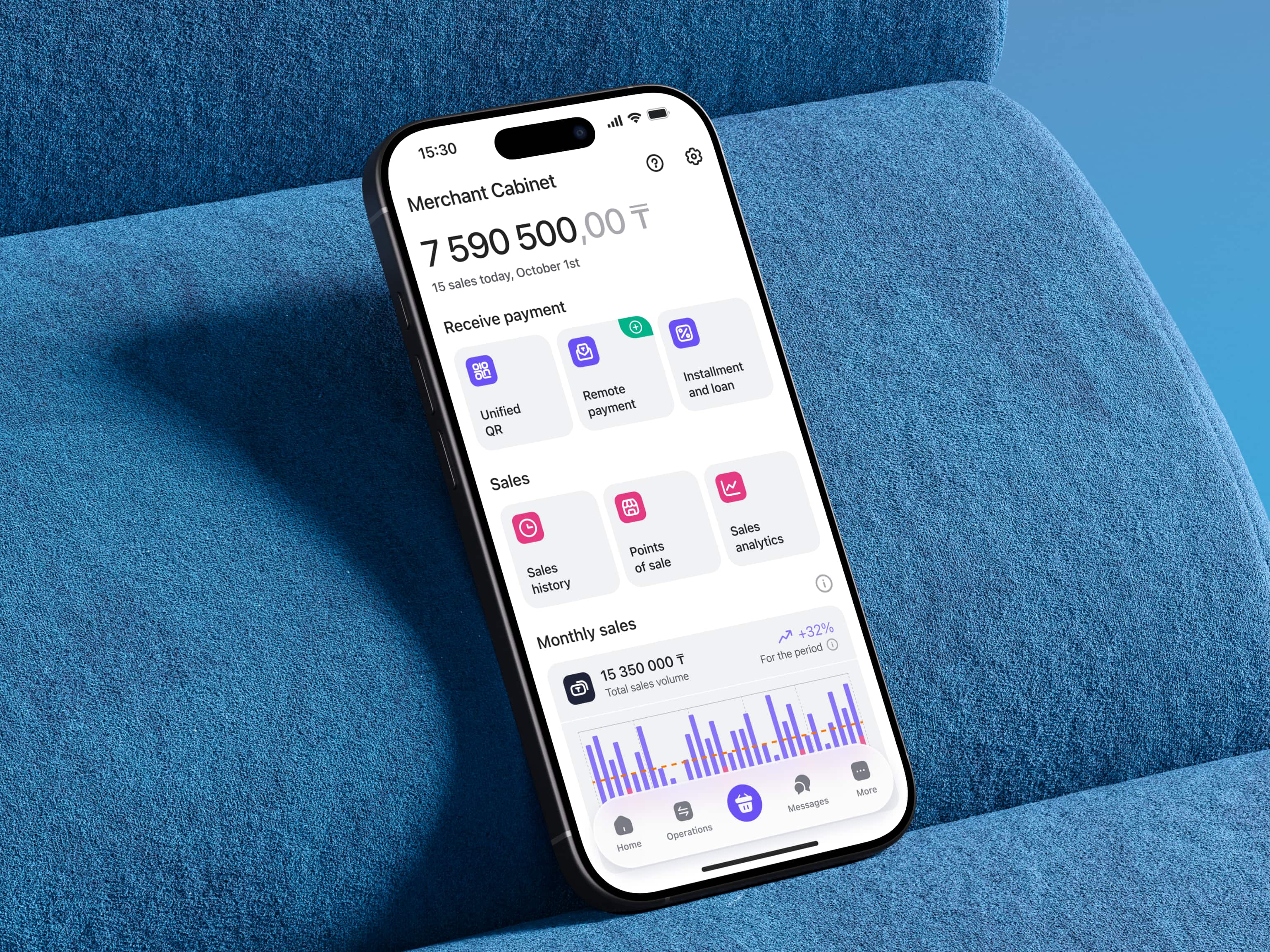
Led product design and discovery for Kazakhstan's flagship SME merchant platform — from MVP to 40,000+ active merchants. Designed and launched Kazakhstan's first interbank Unified QR system, lifting transaction success to 98.5% and merchant satisfaction to a 4.92 sustained VoC.
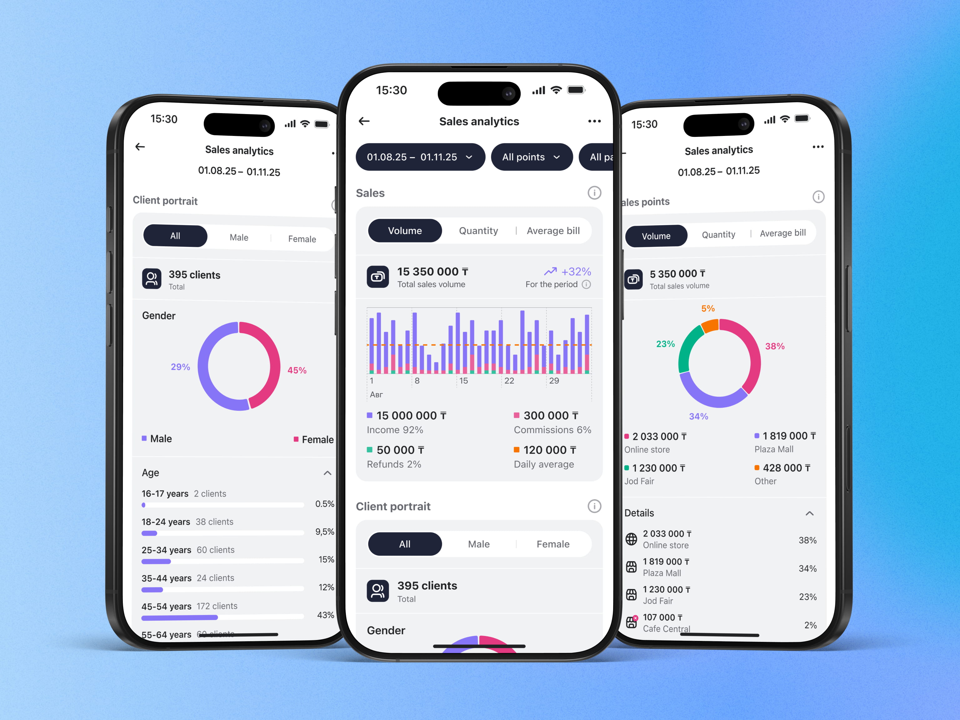
Home Credit Bank Business is the merchant banking platform for small and medium businesses in Kazakhstan — payments, QR acquiring, sales analytics, and business management tools in one place.
I joined as lead product designer at the moment Merchant Cabinet was an MVP with limited features and low perceived value, while the bank was simultaneously preparing for a national-level product milestone: launching Kazakhstan's first interbank Unified QR — a state-driven initiative to unify QR payments across all major banks under a single standard.
Two challenges sat on top of each other. Mature the merchant experience to match enterprise scale. And design a payment flow that hides the complexity of five banks behind a single QR a merchant can generate in under three seconds.
Every decision had to balance UX quality with regulatory constraints from the National Bank of Kazakhstan, monetization targets from the bank's commercial team, and technical limits from a backend integrating multiple bank APIs.
My process is built around closing the loop between hypothesis and shipped metric, not delivering pixel-perfect Figma files. For Merchant Cabinet I ran:
Each feature passed through one cycle: research → prototype → test → launch → metrics → iterate. No feature shipped without an explicit hypothesis tied to a measurable outcome.
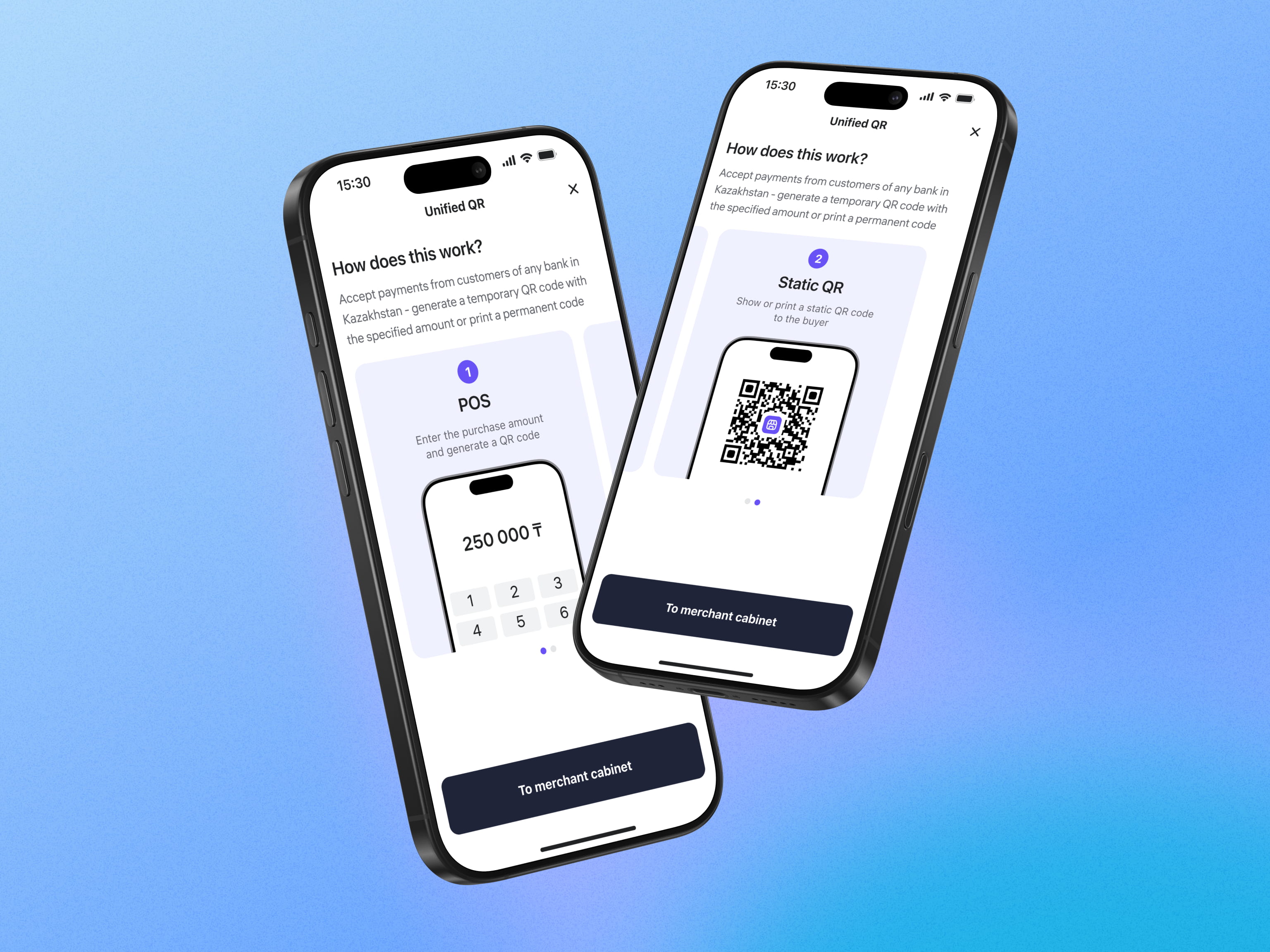
The Unified QR launch was the most consequential design decision of the project, and it had nothing to do with how the QR looked.
The temptation was to expose the multi-bank architecture in the UI — let merchants choose which bank to receive payment through, show the routing logic, surface the technical reality. That would have been honest, and unusable.
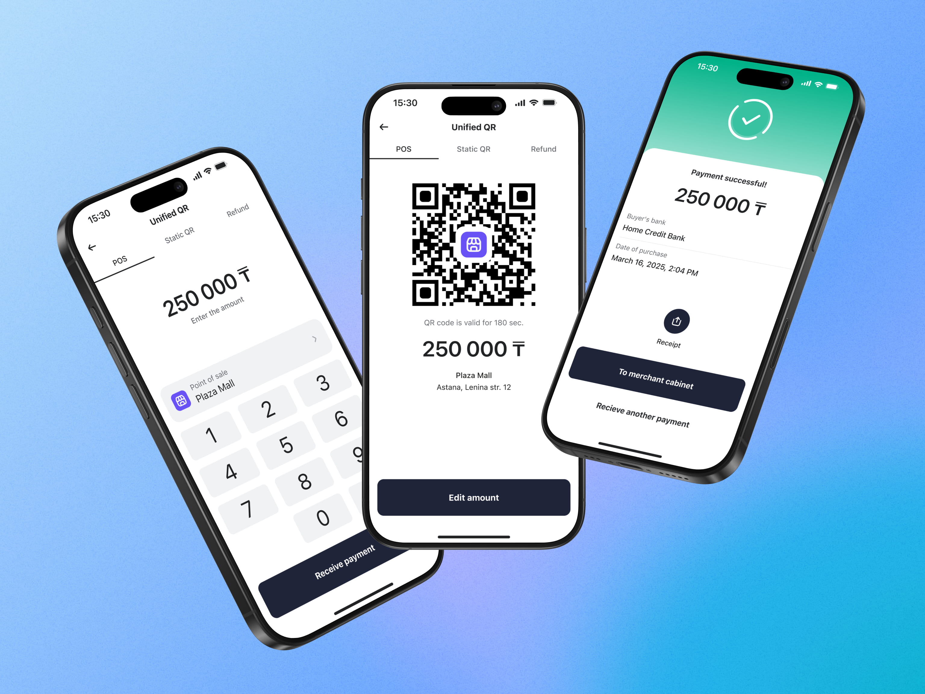
I made the opposite call: the merchant flow shows nothing of the routing complexity. A merchant generates one QR — dynamic for a specific amount, static tied to a POS — and the system handles the inter-bank logic invisibly. Two flows. Three taps to a working QR. The customer scans with any banking app in Kazakhstan, and it works.
This was less a design task than a product-strategy call: which complexity stays in the system, and which leaks into the merchant's day.
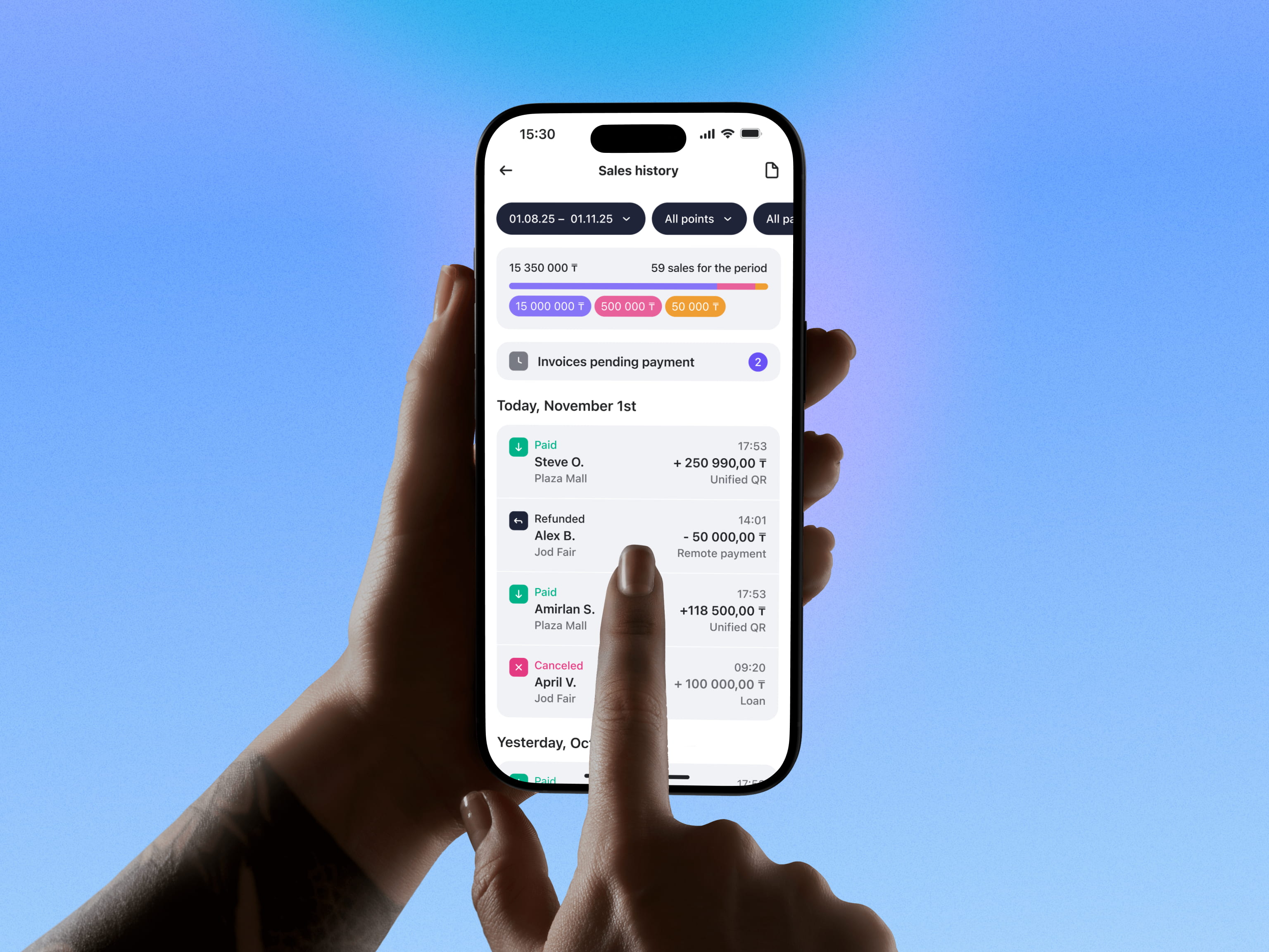
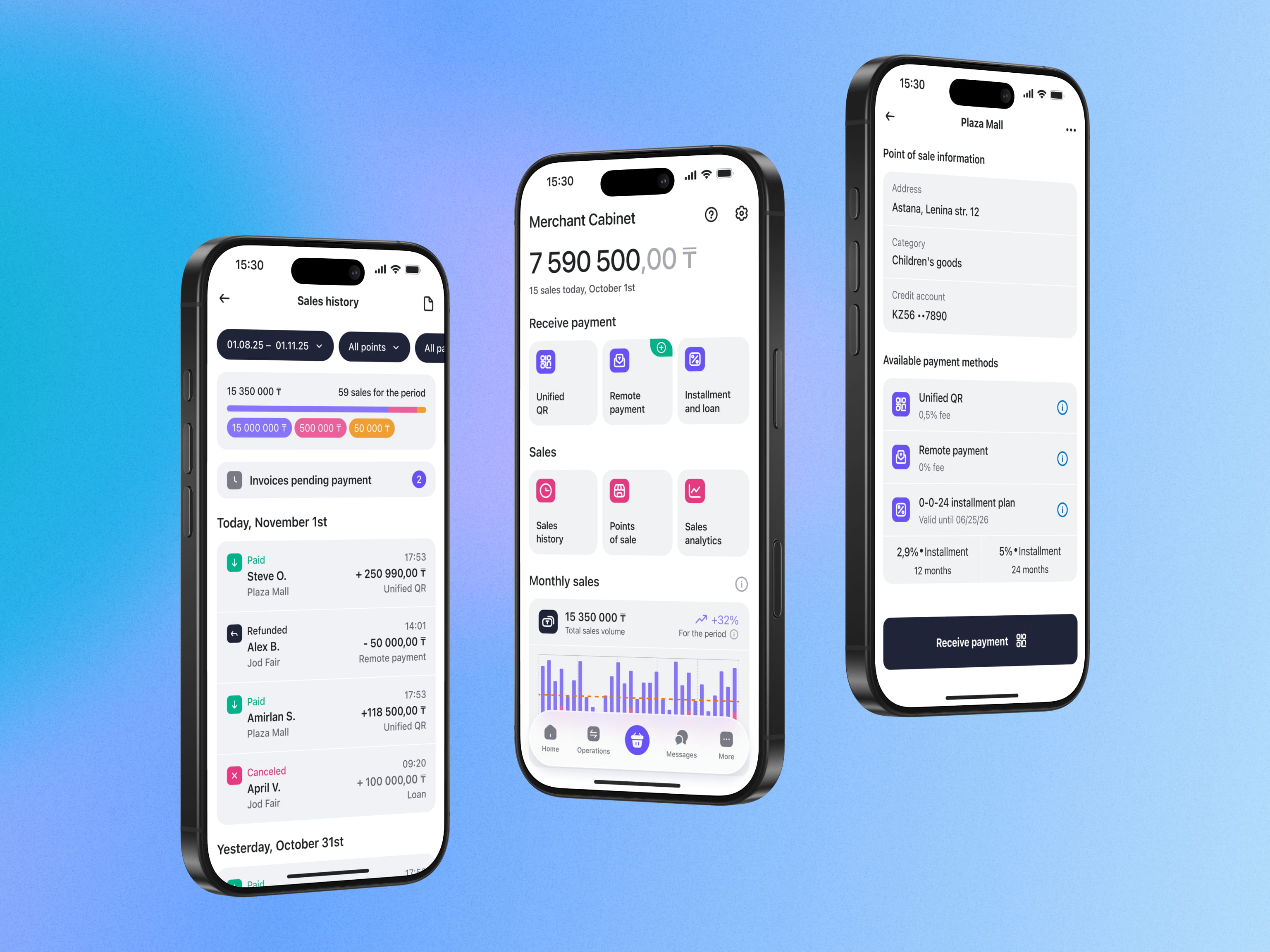
Under that single QR sat three kinds of complexity I had to absorb so the merchant never felt them: interoperability — one code settling across five banks; merchant heterogeneity — sole traders, LLCs, and self-employed each needing a different verification and compliance path (KYB/KYC, limits); and payment states — success, processing, declined, refund, plus multi-POS merchants. I untangled the branching logic with a systems analyst on grooming calls and broke verification into steps, so the hard part stayed inside the system, not on the merchant's screen.
 Unified QR flow — the branching reality behind one merchant QR
Two weeks before a major onboarding release, three new fields landed on the registration form from a compliance request — with no design time attached. Shipping them as-is was the easy path, and the wrong one.
Instead of arguing "bad UX," I ran a three-day guerrilla test with five merchants and measured it: the added fields drove a ~40% drop in onboarding completion. I came back with the data, not an opinion — and proposed a phased split: ship only the legally required fields now, move the rest to post-onboarding.
Alignment took one meeting. We shipped on time, compliance was satisfied, and production completion held at the pre-change baseline. The PM reused the approach as a template for the next compliance request. This is the job in fintech: deciding which complexity the user absorbs, and defending that line with evidence in front of a regulator or a deadline.
A second call under the same pressure. The Payment Invoice feature needed to ship fast — the full cross-bank version would have taken too long. I made a deliberate, team-agreed cut: ship intra-bank first (a complete flow for clients of the same bank), with an explicit roadmap to extend to interbank, now in active build. Conscious scope debt returned to the roadmap, not a silent compromise.
Each feature below ships with a metric attached — because that's how I scoped them at the brief stage.
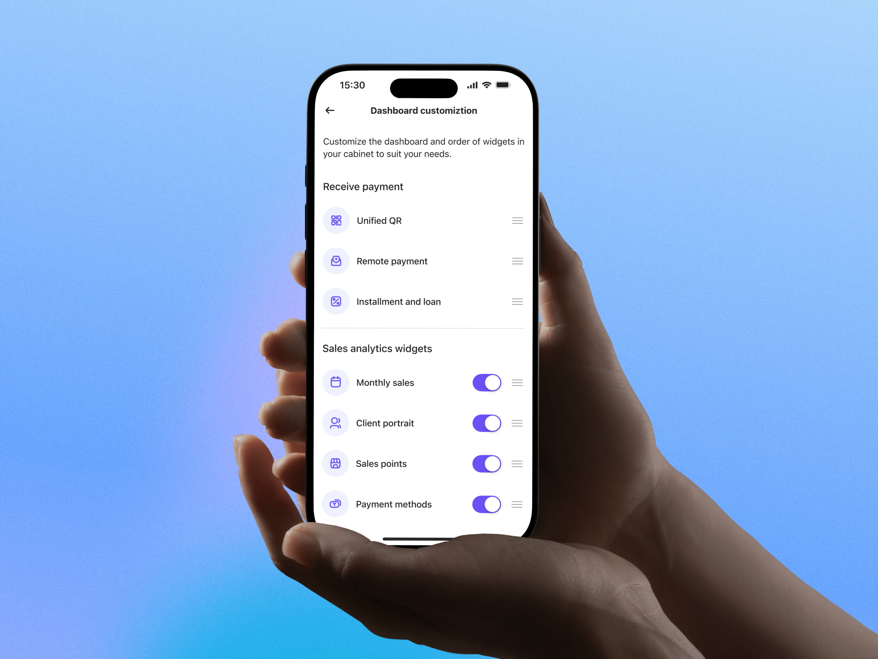
Built the design system from scratch as a parallel track to product features. Goals: consistent UI across iOS, Android, and web admin; predictable handoff for engineering; ability to re-theme without touching components.
92–96% of production colors on tokens, measured by a build-time script in the pipeline — parity is enforced by the system, not asserted on a slide. Reduced handoff time and fewer post-release UI bugs.
This wasn't a side project. The system is the reason new features ship in days instead of weeks, and the reason the product looks coherent across two years of additions.
Components ship with rules, not just pixels. A Button's doc names the pattern (one Primary per view → the main action) and the anti-pattern (never two Primaries → hierarchy collapses; never a Button where a Link belongs → navigation ≠ action; never a colour off-token). That documentation is the context an AI generator needs to produce a real Button, not an invented div.
That governance — documenting the why behind each decision and running design-system workshops with the team — is also how I lead the design function beyond my title: the system holds without me.
Two years in, Merchant Cabinet is the highest-rated SME banking platform in Kazakhstan.
Merchant Cabinet is more than an SME app. The Unified QR launch lowered the barrier for cashless acceptance in Kazakhstan — a country where SMBs have historically defaulted to cash. The design work here wasn't about pretty screens. It was about deciding what complexity stays inside the system and what reaches the merchant, and getting that line right at country scale.
This case is the proof point that design leadership in B2B fintech is not visual polish or component libraries. It's the discipline of tying every product decision to a hypothesis and a metric — and being willing to defend that line in front of a regulator, a commercial stakeholder, or an engineering lead under deadline pressure.
We were one decision away from shipping an information architecture built on the bank's assumptions. The merchant interviews rewrote it. The lesson I keep relearning: in fintech the hardest design problem usually isn't on the screen — it's the trust underneath it, and you only find it by talking to the people who live in the product.
Concretely, that trust comes down to one thing: making a busy merchant believe the money will arrive, across banks they don't control.
Want to discuss this project?